

Tuscan Color Palette: The Intelligence of Sun-Worn Color | Curatora

Tuscany: The Intelligence of Sun-Worn Color
The colors we associate with Tuscany were never really chosen from a palette. They emerged from clay, stone, olive leaves, timber, dust, and years of sunlight. Perhaps that is why Tuscan rooms can teach us something more useful than how to decorate: how to let color belong to a place.
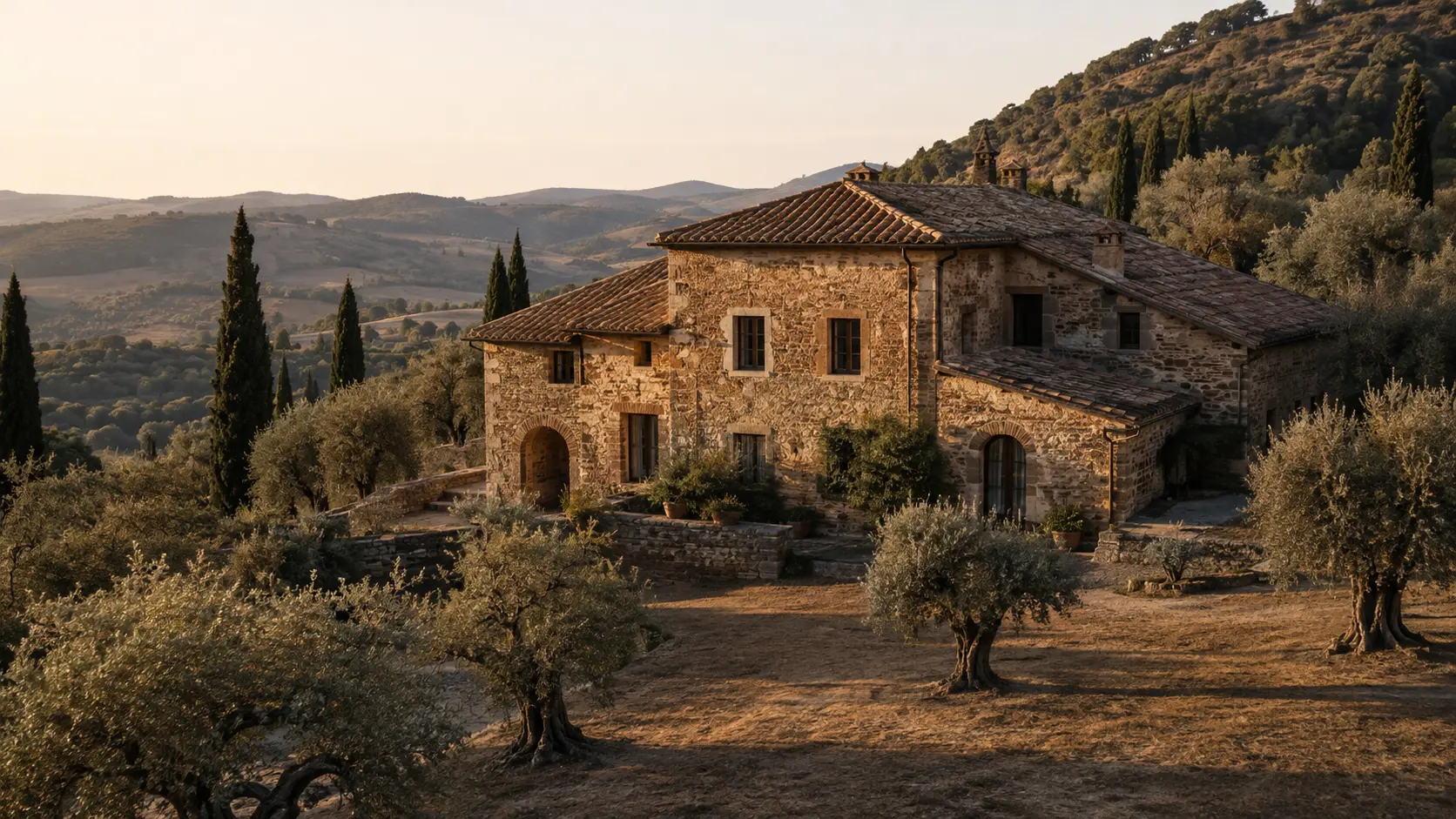
There are rooms that seem to have found their colors naturally.
Nothing appears matched too carefully. The walls do not compete with the floor. The wood does not look selected to complete a scheme. Even the imperfect surfaces seem to belong to one another.
Tuscany often creates this impression. Terracotta, muted olive, pale limestone, dry earth, aged timber, and chalky plaster have become so recognizable that they are now sold back to us as a style. But the interesting thing about Tuscany is not the swatches. It is how those colors came to belong together.
Why a Tuscan Color Palette Feels Different
When a landscape stays with us, color is often one of the first things we remember. We may not recall the exact proportions of a farmhouse window or the pattern of a stone wall, but we remember warmth. Dust. Pale walls in hard afternoon light. The dark vertical rhythm of cypress trees. Olive leaves appearing almost silver when they turn toward the sun.
So when we try to bring the feeling of a place into an interior, color seems like the obvious starting point. Choose terracotta. Add olive green. Find a warm neutral. Introduce some rustic wood. And yet the result can feel strangely artificial. The problem is not that the colors are wrong. The problem is that they have been separated from the conditions that made them convincing.
In Tuscany, terracotta is not simply an orange-brown accent. Stone is not simply beige. Timber is not simply brown. Olive is not simply green. They are materials first and colors second. And that distinction changes almost everything.
The best rooms rarely feel as though someone finished selecting their colors. They feel as though their colors learned to live together.
Color Begins With Material and Light
The wrong assumption: that a palette begins with paint
We tend to think of interior color as something applied. Paint arrives after architecture. Upholstery follows. Then art, objects, and finishing details are introduced until the room appears complete. This encourages us to think of color as a layer placed over a space.
Tuscany suggests another way of seeing it. Color can begin much earlier. It can begin with what a thing is made from. Once materials carry much of the color, the room no longer needs every surface to make a statement. A limestone wall changes throughout the day without being repainted. An old timber beam contains several browns rather than one. Terracotta can move from dusty rose to burnt orange to deep umber depending on light and age.
Sunlight is part of the palette
There is another reason copying Tuscan colors literally often fails: we forget the sun. A terracotta wall photographed in late afternoon is not simply terracotta. It is terracotta plus warm directional light, reflected earth, shadow, surface irregularity, and atmosphere.
Take away those conditions and reproduce the same nominal color on a perfectly smooth wall under cool artificial lighting, and the emotional effect changes. The color may be similar. The experience is not. Light is not merely illuminating color; it is continually rewriting it.
Think in Families, Not Swatches
Perhaps the most useful lesson Tuscany offers is that a room does not need a perfect palette. It needs a family resemblance. Look closely at an old stone façade and there may be cream, sand, ash, ochre, gray, rust, and nearly black shadow. None of those colors needs to match. They simply need to share a world.
That is a more forgiving, and often more sophisticated, way to build an interior. Instead of asking whether the sofa perfectly matches the wall, ask whether they seem to have been affected by the same atmosphere. Instead of choosing one exact terracotta and repeating it three times, allow the idea of terracotta to appear in different temperatures and intensities.
Landscape is useful here because it reminds us how naturally variation can coexist. A work drawn from the language of Landscape Wall Art does not need to reproduce the room around it. It can simply extend the same sense of earth, distance, shadow, or weathered color.
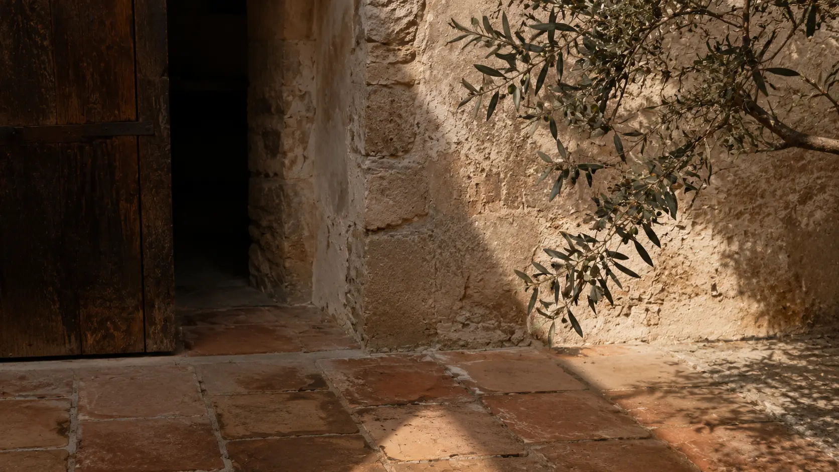
Let neutrals have temperature
The phrase “neutral interior” often suggests the absence of color. But the most convincing neutral rooms are full of it. Warm ivory differs from limestone. Limestone differs from plaster. Plaster differs from undyed linen. They might all look pale at first glance, yet each responds differently to nearby materials and natural light.
A sun-worn palette is not reduced because nothing is happening. It is reduced because the differences are small enough to reward attention.
Art as Resonance, Not Matching
Art becomes especially interesting inside this kind of palette because it does not need to behave like a matching accessory. In fact, it is often better when it does not.
If the room already speaks in limestone, linen, walnut, clay, and olive, an artwork can continue the atmosphere while introducing something the furnishings cannot: distance, tension, narrative, abstraction, or a sudden concentration of color.
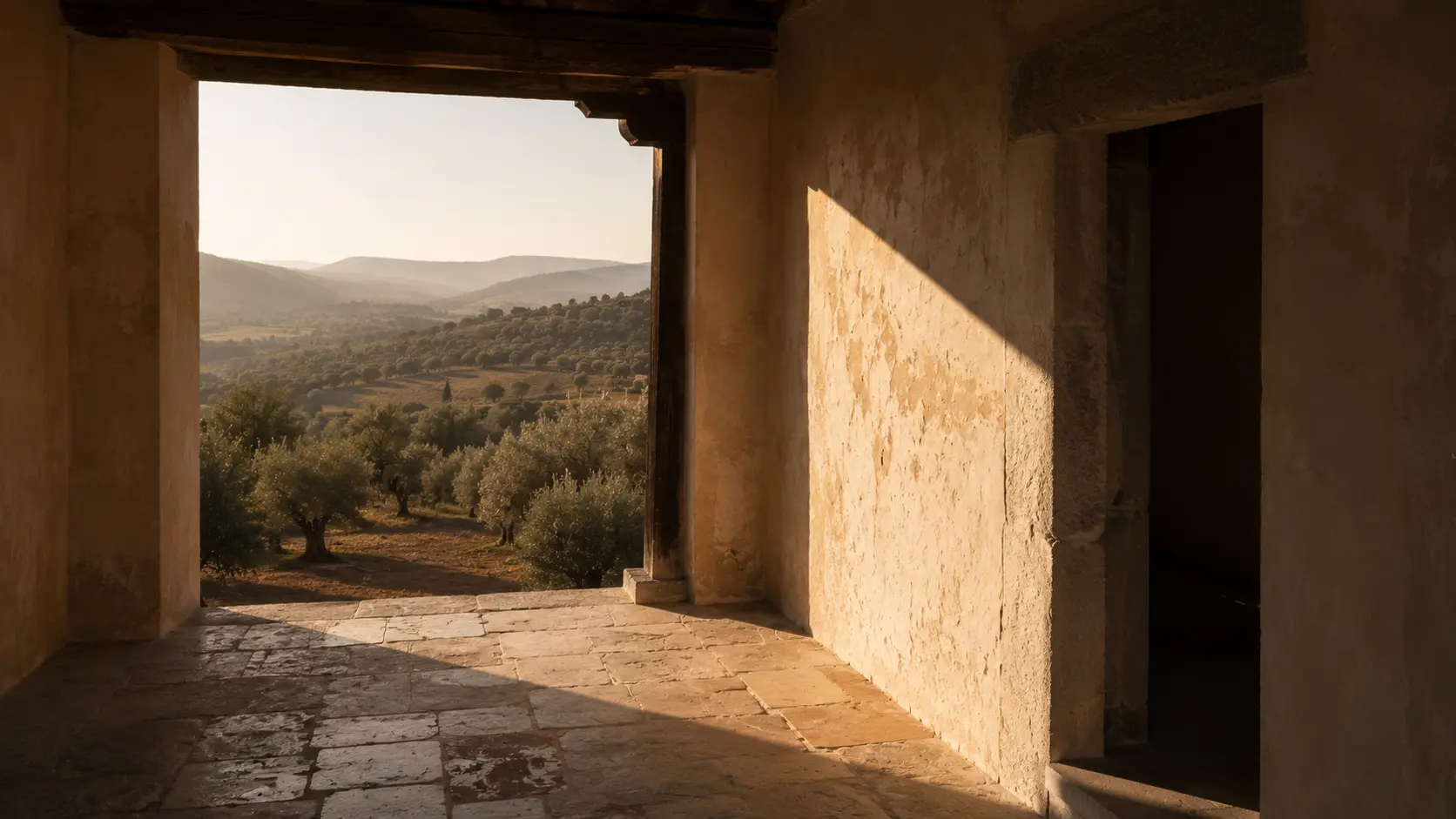
This is where the relationship between art and interior design becomes less about coordination and more about resonance. A landscape does not have to reproduce the room’s colors exactly. An abstract work does not have to contain the sofa fabric. A monochrome piece does not need to disappear politely into the wall.
The stronger question is whether the artwork belongs to the same emotional temperature. A quiet interior might support a dramatic work precisely because the surrounding materials give it space. A warm room might become more interesting when the artwork introduces charcoal, mineral gray, or a cooler green.
This is also why thoughtfully chosen Premium Wall Art can work best when it is allowed to participate in the room rather than merely complete it.
Three Lessons for a Contemporary Room
None of this requires turning a home into a Tuscan farmhouse. That would miss the point. The most interesting design lessons travel well precisely because they do not require copying their source literally.
1. Begin with one material that already has depth
Choose something whose color is naturally variable: limestone, travertine, aged oak, unbleached linen, hand-finished plaster, terracotta, or an artwork built from earthy pigments. A naturally varied material gives the room several nearby tones at once.
A machine-perfect flat brown asks other elements to either match or contrast with it. A piece of walnut already contains its own transitions. A slab of stone may carry cream, gray, warm beige, and mineral markings within a single surface. Those materials make rooms easier to layer because they are already layered themselves.
2. Add a muted living color
This is where olive becomes useful, not because olive green is “Tuscan,” but because it behaves almost like a neutral. Its gray and yellow undertones make it comfortable beside timber, stone, plaster, blackened metal, and warm white.
But the principle could work with other landscape colors: dusty sage, dried tobacco, muted ochre, clay red, or smoke blue. These colors should feel as if a little atmosphere has passed through them. A living color gives a restrained interior energy without breaking its calm.
3. Protect the shadows
We often focus so intensely on creating warm interiors that we remove the darker values that make warmth visible. Tuscany does the opposite. Bright walls can sit beside almost black shutters. Sunlit stone becomes more luminous because an archway falls into shadow. A pale road feels brighter beside the dark punctuation of cypress trees.
In a home, that darker note might be a charcoal frame, smoked timber, an iron lamp, a deep brown cabinet, or the darkest passage inside an artwork. In a Living Room Wall Art setting, that contrast can give both the artwork and the surrounding materials greater clarity without making the room feel severe.
The Intelligence of Imperfection
Perhaps the most beautiful thing about a material-led palette is that it does not remain visually fixed. Morning makes one room. Midday makes another. Late afternoon discovers colors that were almost invisible hours earlier.
This is why an interior should sometimes be judged without turning on every lamp. Look at it in natural light. Notice which surfaces become warmer, which become flatter, and which materials develop texture when light moves across them rather than directly toward them. Look at the artwork at different hours too. A dark painting that seems severe at noon may become extraordinarily deep in evening light. A pale work may almost merge with a plaster wall in the morning, then separate from it as shadows become longer.
Living with art means allowing these changes. It means understanding that an artwork does not have one fixed appearance any more than a room does. The relationship evolves.
We often try to make interiors coherent by controlling them: exact paint specifications, matching finishes, repeated metals, consistent woods, perfectly distributed accent colors. There is nothing inherently wrong with any of this. Discipline can create beautiful rooms. But Tuscany offers another kind of discipline: not perfect repetition, but continuity.
The materials vary, but they belong together. The tones shift, but they remain related. Surfaces age differently, but the aging itself becomes part of the visual language. That is why “sun-worn” color is such a useful idea. It describes color that has lost the need to look new.
The most memorable rooms rarely feel perfectly coordinated. They feel settled—as though their materials, colors, shadows, and artworks have learned how to live together.
At The House of Curatora, that is perhaps the more enduring way to think about living with art: not as the final object added to complete a palette, but as one of the elements through which a room develops its own visual memory.
What makes a room stay with you?