

Why Surface Changes the Meaning of an Image

Why Surface Changes the Meaning of an Image
An image is never experienced in isolation. Matte paper softens it. Acrylic sharpens it. Canvas gives it physical memory. Metal can turn light itself into part of the composition. The subject may remain unchanged, but the surface quietly alters how the image enters a room—and how we remember it.
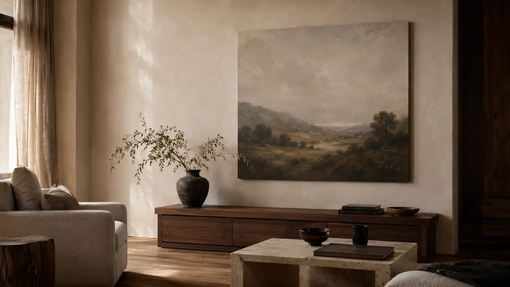
Late-afternoon light moves across a wall.
For a few minutes, an image that seemed quiet all morning begins to change. A dark area catches a reflection. A pale section becomes warmer. Texture that had almost disappeared from across the room suddenly becomes visible.
Nothing inside the image has changed. The surface has.
Why Surface Changes the Meaning of an Image
This is one of the more overlooked aspects of choosing art for an interior. We tend to think first about subject, color, scale and perhaps framing. We ask whether an image belongs above a sofa, whether its tones work beside a particular stone or fabric, or whether its proportions suit the wall.
Yet the material carrying the image is not merely a technical decision made after the artwork has been chosen. It participates in the image.
A photograph printed with a restrained matte finish may feel contemplative and distant. The same photograph behind a luminous acrylic surface can become sharper, more immediate and almost cinematic. On canvas, it may acquire softness, physicality and a subtle association with painting. On metal, its highlights and contrast can become architectural.
The picture remains recognizable. Its character does not.
We often speak about an image as though it were independent from the object on which we see it. In reality, seeing is always physical.
Light reaches a surface. That surface absorbs, scatters or reflects part of it. Texture alters the edges we perceive. Gloss creates changing highlights. Matte finishes reduce them. The depth of a material may make an image appear almost contained within an object rather than sitting upon it.
Our interpretation responds to all of this before we consciously describe what is happening.
This is why two prints made from exactly the same digital image can create remarkably different emotional impressions. The difference is not necessarily about one being better than another. It is about what each surface asks the image to become.
The surface does not simply carry an image; it becomes part of the way the image speaks.
That distinction matters particularly in interiors. A room already contains materials with their own visual languages: timber, plaster, linen, velvet, glass, marble, steel, aged brass, painted walls, polished stone.
Artwork enters that conversation. Its surface determines how loudly—or quietly—it participates.
Matte, Gloss and the Character of Light
Matte Surfaces Create Distance
Matte surfaces tend to reduce reflections and soften the immediate presence of light. That sounds like a simple technical characteristic, but visually it can produce something more interesting: distance.
Without a strong reflective layer, the eye is allowed to enter the image with relatively little interference from the room around it. There is less spectacle. More looking.
A muted landscape, architectural study, monochrome photograph or restrained abstract composition can feel especially natural on a matte surface because the material does not demand attention separate from the image.
The result can feel almost editorial. It recalls printed books, photographic folios, museum works on paper and archival material. There is often a sense that the viewer is being invited to examine rather than simply notice.
Reduced reflection can also make color feel more settled. Dark tones may appear softer. Pale colors can feel chalkier or more atmospheric. Highly saturated colors sometimes seem slightly less assertive.
This is why matte should not automatically be understood as neutral. Its restraint is itself expressive.
Gloss and Depth Increase Immediacy
Acrylic changes the relationship between artwork and light almost immediately.
The image can appear more saturated, defined and optically deep. Highlights become clearer. Dark areas can feel richer. Fine details may become more pronounced.
The result is often described as contemporary, but that description only explains part of the effect. The more important difference is psychological.
A glossy or optically deep surface brings the image forward. Instead of quietly occupying the wall, it begins to interact with the viewer’s position, the windows and the changing light within the space.
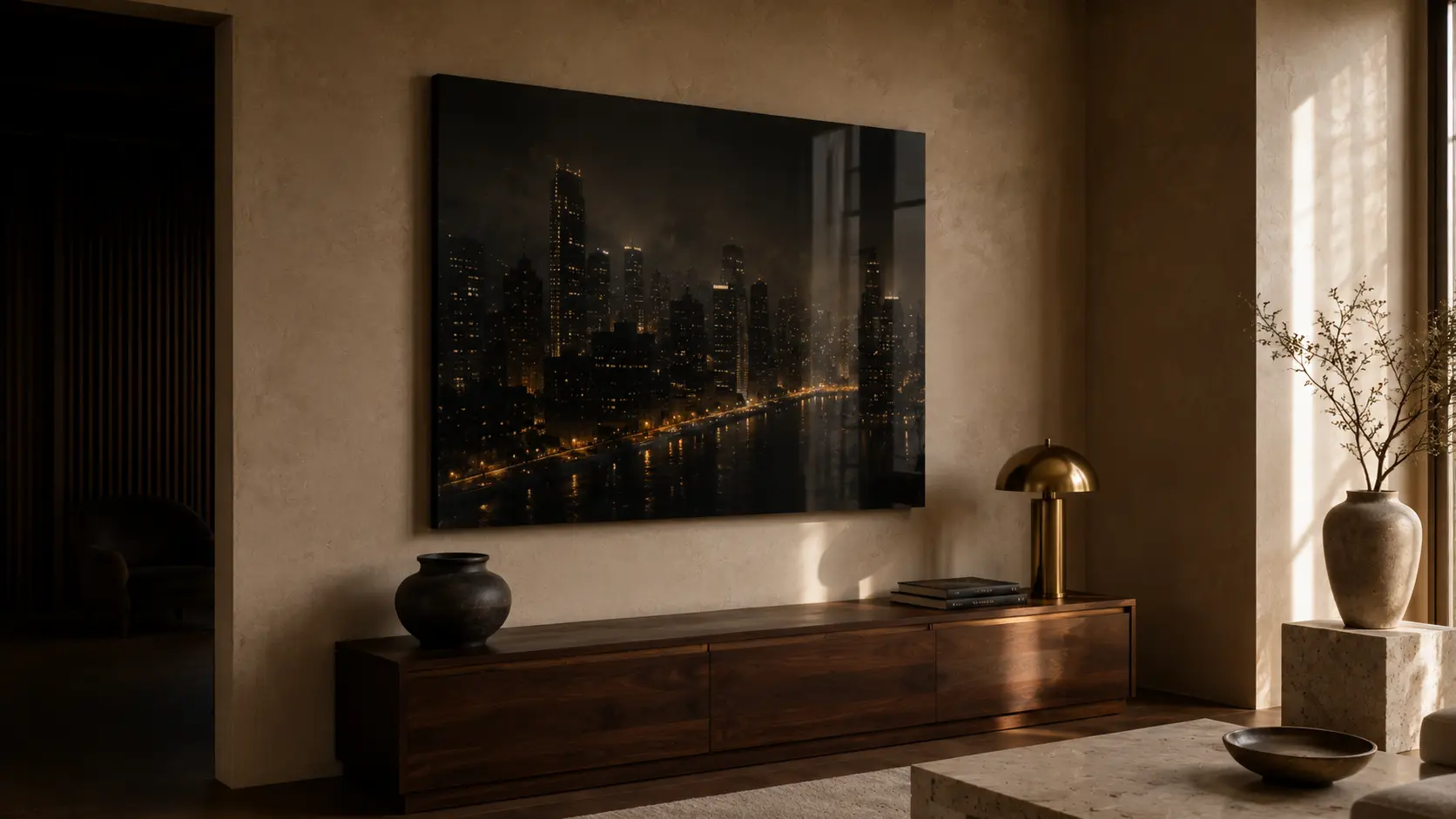
A polished surface can give a cityscape at night an entirely different emotional temperature from the same scene presented on matte paper. Reflections become appropriate. Glass, rain, headlights, illuminated buildings and wet streets already belong to a world of luminous surfaces. The material and the subject begin to reinforce one another.
But the opposite can also be powerful. Place a quiet classical image behind a highly polished surface and suddenly historical subject matter may feel unexpectedly modern.
This is where surface begins to change meaning rather than merely appearance.
Texture, Memory and Material Presence
Canvas does something that neither matte paper nor polished acrylic does in quite the same way. It introduces visible physical texture.
Even when the image is photographic, the woven surface creates a subtle connection with the history of painting. The eye notices the image. The body notices the object.
That distinction is important. Texture creates tiny interruptions in perfectly smooth color fields and fine photographic detail. From close range, the material reminds us that we are looking at something physical. From farther away, the texture becomes quieter.
This shifting experience can give canvas an unusually domestic quality. It feels comfortable around timber, upholstery, plaster and other materials that reveal their own texture. It can soften highly precise digital imagery and make it feel less screen-like.
There is also a cultural memory attached to canvas. For centuries, paintings encountered in homes, studios, galleries and museums have taught us to associate woven surfaces with art objects.
We carry some of that association with us even when the image itself was created photographically or digitally. The material quietly borrows from that history.
In a carefully composed living room wall art setting, this material relationship can matter as much as color or subject. The artwork becomes part of the room’s tactile vocabulary rather than an isolated object placed on a wall.
The Image Becomes an Object
Surface changes our sense of whether an artwork feels primarily like a picture or like a physical object. That distinction may be subtle, but it can transform how comfortably the work sits beside furniture, textiles and architectural materials.
A surface with visible texture may feel more connected to linen, wood and plaster. A polished surface may speak more naturally to glass, lacquer or stone. Neither approach requires literal matching. What matters is the conversation between materials.
When the Surface Becomes Architectural
Metal introduces another kind of transformation. Where canvas often adds softness, metal can emphasize precision, structure and luminosity.
This can be particularly striking with architecture, monochrome photography, industrial scenes, modern abstractions and images containing strong areas of light and shadow.
The material feels less like paper and more like an object belonging to the architecture of the room.
Imagine a dark photographic image in a room with blackened steel details, polished stone and restrained modern furniture. On textured canvas, the image might soften the space. On metal, it could strengthen its architectural clarity.
Neither interpretation is inherently correct. They simply produce different relationships.
And this points toward a more useful way of thinking about art materials: do not ask only what surface makes the image look best. Ask what relationship you want the image to have with the room.
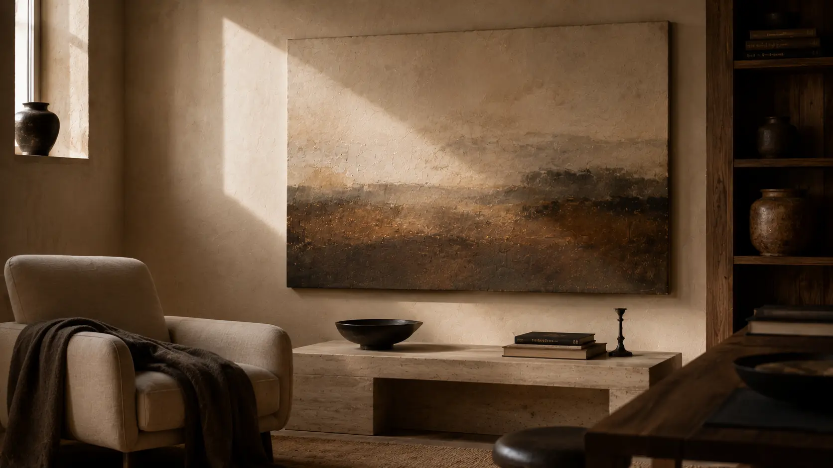
Surface cannot be chosen entirely from a product image on a screen because surfaces respond to environments. A north-facing room with diffused daylight behaves differently from a sunlit south-facing room. A softly illuminated bedroom creates different conditions from a bright open-plan living space.
A reflective surface may appear dramatic and luminous in one place and distracting in another. A matte finish that feels beautifully restrained in daylight may become almost velvety under warm evening lamps.
This means the room itself becomes part of the viewing experience.
Consider a large artwork positioned opposite a window. If its surface is reflective, the window becomes an invisible collaborator in the composition. Clouds, trees and movement outside may briefly appear across the image.
Sometimes this creates extraordinary depth. Sometimes it prevents comfortable viewing.
Move that same artwork to a perpendicular wall and its character changes again.
Surface therefore introduces something unusually dynamic into an otherwise static object. It allows time of day, weather and artificial lighting to influence how the artwork is perceived.
Morning art is not always evening art.
How to Think About Surface at Home
You do not need specialist knowledge to make these decisions. In many cases, simply paying attention to the materials already present in the room will tell you more than studying technical specifications.
Begin With the Light
Stand where the artwork will eventually hang. Look toward the wall during the brightest part of the day.
Does direct sunlight reach it? Is there a large window opposite? Are there pendant lights or lamps that could create strong reflections at night?
If reflections are likely to dominate, a matte or textured surface may preserve a calmer viewing experience. If the wall receives controlled, indirect light, a reflective or luminous finish may become an asset.
The goal is not necessarily to eliminate reflection. It is to decide whether reflection belongs to the experience you want.
Look at the Materials Already in the Room
A room built around natural textures often responds beautifully to surfaces with similar restraint. Canvas beside linen, timber and plaster can feel coherent without becoming overly coordinated. Matte artwork against richly veined stone may offer visual relief. Acrylic beside glass, lacquer or polished marble can introduce a deliberate sense of precision. Metal can echo architectural details without requiring the image itself to depict architecture.
Think in terms of material conversations rather than matching. The strongest interiors rarely repeat everything literally. Instead, they establish relationships.
This is one reason browsing a broader collection of premium wall art can be useful as a visual exercise: not to search for a single “correct” finish, but to notice how different images and surfaces might participate in the architecture of a room.
Ask What the Image Should Feel Like
This may be the most useful question of all.
Should the image feel quiet? Immediate? Tactile? Precise? Atmospheric? Object-like? Almost luminous?
Material decisions become much easier once the desired emotional character has been identified.
A hazy landscape intended to create a contemplative pause might call for one treatment. The same landscape chosen because of its intense sunset colors might call for another.
The subject alone does not decide. Your intention does.
Consider Viewing Distance
There is another factor we rarely consider when selecting artwork: how close we expect to stand.
Some works are encountered primarily from across a room. Others hang in hallways, reading corners or dining areas where viewers naturally approach them.
Texture rewards proximity. Highly detailed glossy surfaces can reward changing viewpoints. Matte works often remain visually stable across a wider range of positions.
This means scale, placement and material should ideally be considered together.
A large canvas viewed from several meters away may first register as an image and reveal its texture only when someone approaches it. That gradual discovery can be beautiful.
A polished acrylic work may announce its depth immediately from across the room. A metal surface may reveal subtle tonal shifts as the viewer passes.
The image is technically still. The experience is not.
Choosing With the Eye—and With Memory
Our responses to materials are partly visual and partly remembered.
Canvas can remind us of paintings we have encountered elsewhere. Matte paper may recall books, photographs, archives or museum works. Gloss can evoke photography, cinema, glass and contemporary visual culture. Metal can suggest architecture, permanence and precision.
These associations are not universal. They come from experience.
Which is precisely why selecting an art surface is rarely a purely decorative choice. We bring memories to materials.
A surface can make an unfamiliar image somehow feel familiar, or make a familiar image feel unexpectedly new.
The same picture that appears nostalgic on textured canvas might become cinematic behind acrylic. The same monochrome photograph that feels documentary on matte paper can feel architectural on metal.
No subject has only one material identity.
Perhaps the most interesting thing about surface is that it reminds us that artwork does not stop where the picture ends.
It continues into light. Into texture. Into architecture. Into the distance from which we view it. Into the materials surrounding it. And into whatever associations we bring to the act of looking.
This is why choosing between matte, gloss, canvas or metal is more than selecting a finish. It is choosing how an image will exist physically in your life.
There may never be one universally correct surface for a particular image. There is only the version that creates the relationship you want between image, light and room.
Do you choose art with your eye, your memory, or both?
At The House of Curatora, we think of interiors as rooms shaped by art—and sometimes the quietest thing shaping that relationship is the surface on which the image lives.