

Blog
Why We Remember Places by Color

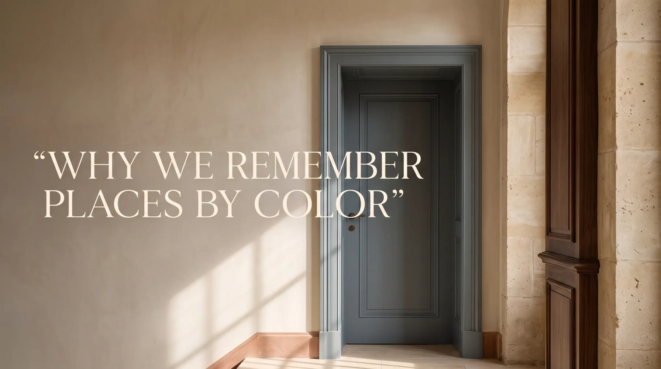
Why We Remember Places by Color
Some places stay with us because of what happened there. Others remain for reasons that are harder to explain: the blue of an evening street, the ochre of an old wall, the muted green of a quiet room. Long after details disappear, color often remains.
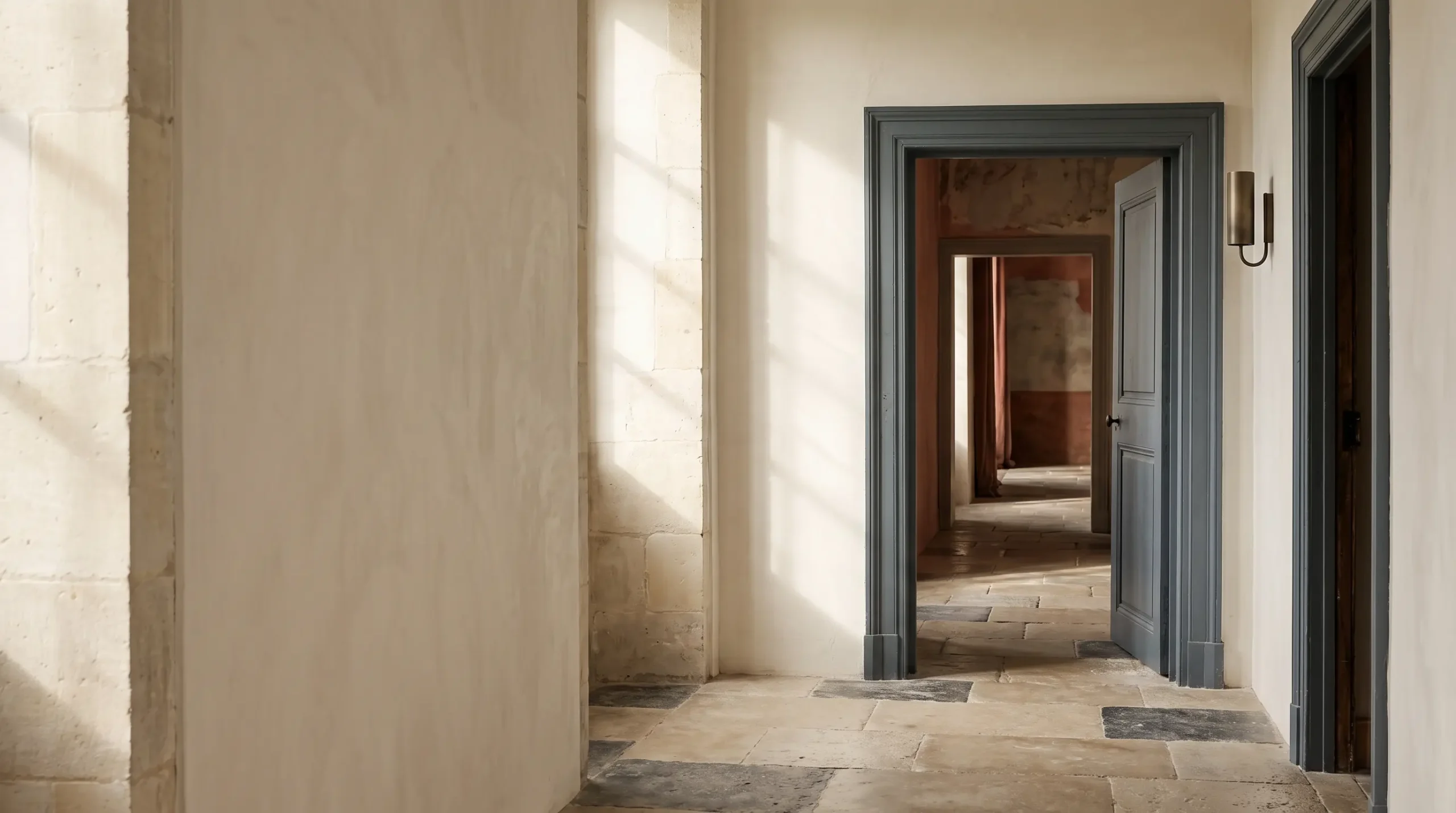
There are places I can no longer describe accurately, yet I can still remember their color.
I may forget the exact shape of the windows, the arrangement of the furniture, or which side of the street a building stood on. But I remember a pale stone facade warmed by late-afternoon light. A hotel corridor washed in deep burgundy. A coastal town that seemed to exist almost entirely in white, faded blue, and sun-bleached beige.
Memory is rarely an architectural drawing. It does not preserve every proportion, surface, and object with equal precision. Instead, it seems to edit. Certain details sharpen while others quietly disappear. And very often, color survives that editing process.
This may be why we describe places in chromatic terms without noticing it: the blue house, the green kitchen, the golden city at dusk, the gray winter street, the room with the red walls. Color becomes a shorthand for atmosphere—and atmosphere, perhaps more than form, is what memory wants to keep.
Color and the Atmosphere of Place
When we enter a room, we may consciously register its furniture, scale, artwork, or architectural style. But before we begin naming those things, we have already received an impression.
Warm or cool. Soft or severe. Bright or muted. Restful or restless.
Color participates in that first impression before we have time to analyze it. A room composed of limestone, washed linen, pale oak, and quiet ivory does not simply look different from one built around charcoal, walnut, oxblood, and aged brass. It asks something different of the eye. It changes the pace at which we look.
The same is true of cities. Consider the difference between a place shaped by sun-faded terracotta and one defined by slate, fog, dark timber, and deep green. Architecture matters enormously, but color gives architecture a climate of its own.
A wall is never simply a wall. It can be chalk white beneath Mediterranean light, brown stone after rain, warm plaster at sunset, or almost blue in winter shadow. The physical structure may remain unchanged while our experience of it changes completely.
We may enter a place through architecture, but we often carry it away through color.
Perhaps this is why a particular tone can return a place to us so quickly. A dusty clay red, a softened olive, or a certain blue-gray encountered years later can create a feeling of recognition before we understand where it came from.
The response comes first. The explanation follows.
Do We Remember Color—or the Story Around It?
There is an obvious argument against giving color too much importance.
Perhaps we do not remember places because of their colors at all. Perhaps we remember emotion, weather, companionship, novelty, or the events that happened there, and color simply becomes attached to the experience.
A childhood kitchen may seem vividly yellow because it was a place of comfort. A dark green library may feel unforgettable because of the time spent there. A room overlooking the sea may become permanently blue in memory because the journey itself mattered.
That objection is worth taking seriously.
Color does not exist in isolation. We rarely experience a palette as a detached design exercise. Color arrives together with light, material, scale, sound, temperature, texture, and emotion.
Even the same color can feel entirely different depending on its surroundings. Deep red in a lively restaurant may feel theatrical and energetic. The same red in a quiet historic interior can feel intimate, solemn, or ceremonial.
So perhaps the question is not whether color creates memory by itself.
A more useful question is how color helps memory organize experience.
Color may work less like a photograph and more like a title. It gives a complicated experience a simple visual identity. When dozens of individual details eventually blur, that identity can remain.
Three Ways Color Becomes Part of Memory
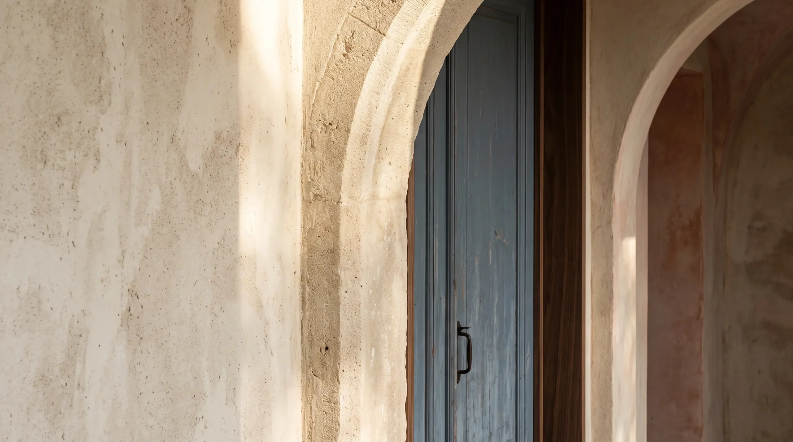
1. Color Gives a Place an Emotional Temperature
We often describe color through the language of temperature: warm whites, cool grays, fiery reds, icy blues. The language is metaphorical, yet it reveals something about the way we experience interiors.
Color changes the emotional temperature of space. Warm neutrals can soften architectural form. Darker tones can make a large room feel more contained. Cool colors can introduce visual distance and quiet. Stronger color can create intensity even when the room itself contains relatively few objects.
This does not mean that one color always produces one emotion. There is no reliable formula in which blue must mean calm or red must mean excitement. Context matters too much for that.
What matters is relationship.
A muted blue beside aged oak feels different from that same blue beside polished metal. Olive green against worn plaster carries a different mood than olive green against glossy black lacquer.
Memory seems particularly sensitive to these relationships. We remember not simply brown, but walnut beneath amber light. Not simply white, but chalky stone against a clear blue sky. Not simply gray, but mineral stone after rain.
The palette becomes inseparable from the sensation of being there.
2. Repetition Turns Color Into Identity
Some places are remembered through a single striking color. Others become memorable because a limited family of colors repeats so consistently that it begins to feel like part of the architecture itself.
This happens at every scale. A city may repeat the same stone across facades, pavements, and monuments. A coastal landscape may repeatedly place sand, weathered timber, sea blue, and whitewashed surfaces beside one another. An interior might allow variations of cream, bronze, tobacco, olive, and charcoal to appear across textiles, artwork, wood, and metal.
Repetition creates visual coherence, and coherence gives memory a structure.
When too many unrelated colors compete for attention, we may remember individual objects without remembering the room as a whole. When colors echo one another, the eye begins to understand the environment as a single composition.
This is one reason restrained interiors can remain vivid in memory even when they contain relatively little decoration. They give the eye fewer ideas, but allow those ideas to become stronger.
3. Contrast Gives Memory a Focal Point
Memory rarely treats every part of a scene equally. Certain details become anchors.
A black doorway against pale plaster. A cobalt shutter on weathered stone. A rust-colored chair inside an ivory room. A dark artwork surrounded by a luminous wall.
Contrast directs attention, and attention gives memory somewhere to settle.
This helps explain why a small amount of color can sometimes be more memorable than a large amount of it. When everything is visually intense, nothing receives the privilege of emphasis.
The important idea is not simply to add a bold color. It is to understand what the contrast is doing.
Sometimes contrast creates drama. Sometimes it establishes rhythm. Sometimes it draws attention toward an architectural feature. Sometimes it allows a piece of wall art to become the emotional center of an otherwise quiet interior.
Color is relational. The blue appears bluer because of the stone beside it. Black feels deeper because the room is pale. Bronze appears warmer because the wall is cool.
What we remember is often not the color itself, but the tension between colors.
Why Interiors Stay With Us as Palettes
Think about a room you remember clearly—not the room you are sitting in now, and not necessarily a famous interior, but somewhere you have not seen for several years.
What appears first?
You may be surprised by how incomplete the image is. Perhaps you remember where the windows were but not the furniture. Perhaps you remember one chair but not the floor. Perhaps the entire space returns as little more than a palette.
Cream walls. A dark wooden table. Green curtains. Afternoon light.
That may be enough.
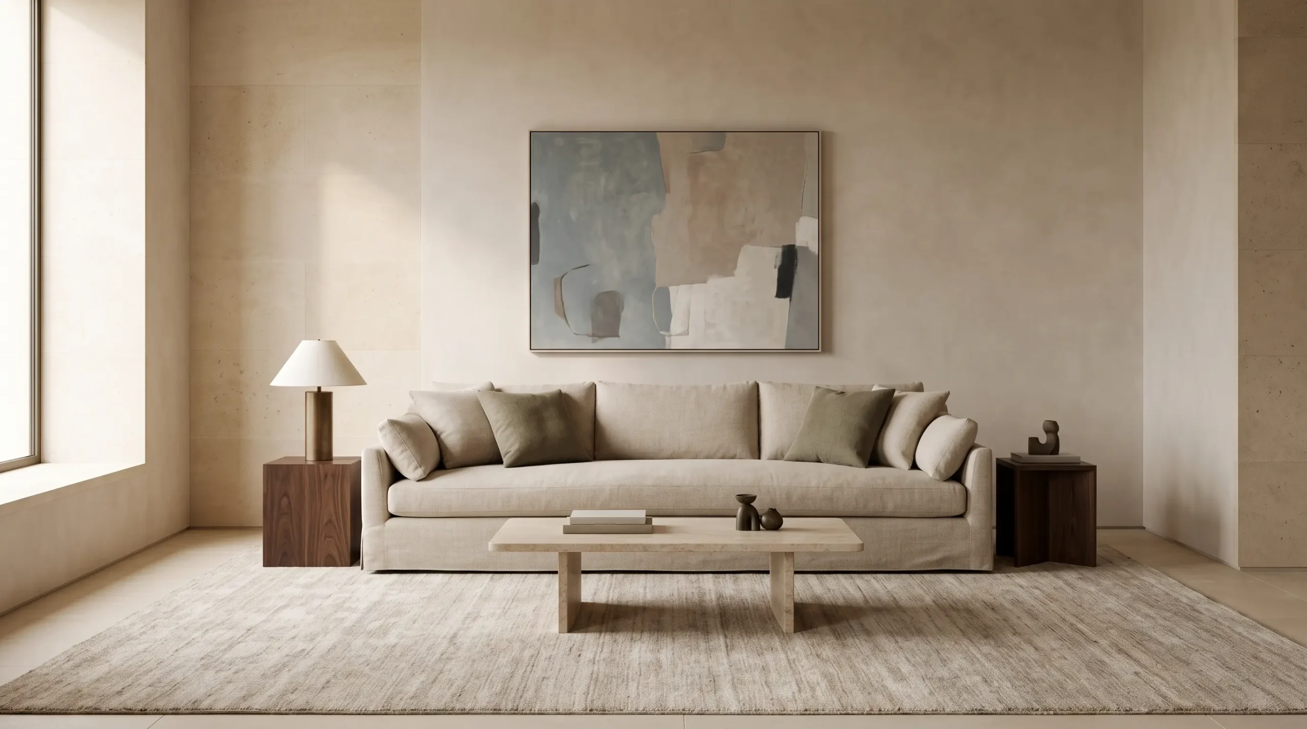
Interior design is often discussed through objects: which sofa, which table, which lamp, which artwork. Yet lived experience is less categorical.
We do not encounter a room as an inventory. We encounter relationships.
The wall beside the artwork. The rug beneath the chair. The curtain changing the daylight. The shadow making a corner appear darker at five in the afternoon than it did at noon.
Color is constantly moving through those relationships, even when the objects themselves remain still.
This is also why photographs can sometimes fail to represent a room we know well. A photograph records a single moment. Memory combines many moments.
Morning light may become mixed with evening shadow. Summer brightness may merge with winter quiet. The room we remember may never have existed exactly as memory presents it.
And yet its color identity can feel completely true.
A Color World Rather Than a Matching Scheme
There is a useful distinction between a color scheme and what might be called a color world.
A color scheme is usually deliberate and finite. It can be listed: beige, olive, black, bronze.
A color world is broader. It includes variations, light conditions, materials, surfaces, and associations.
Consider an interior built around earthy greens. The idea does not need to mean repeating the exact same olive tone across cushions, walls, and artwork. It might instead include moss, weathered sage, deep forest green, aged stone, warm timber, mineral gray, and muted brass.
The colors belong together without matching exactly.
They create a visual environment rather than a coordinated set.
This way of thinking also offers another way to explore Curatora’s Shop by Colours collection: not simply by asking whether a piece contains blue, green, terracotta, brown, or black, but by considering what kind of interior world those colors might belong to.
The broader Color Worlds idea follows the same principle. A deep Prussian blue can feel coastal in one setting, architectural in another, and almost nocturnal beside charcoal and silver. Terracotta may suggest old plaster, sun-warmed landscape, clay, or the quiet warmth of an earth-toned interior.
Color becomes valuable not as a label but as a relationship.
That distinction matters because homes rarely benefit from perfect coordination. Perfect matching can flatten a room. Memory needs variation.
A space becomes more convincing when colors feel related rather than identical—when they appear to have arrived from the same visual world without looking as though they were selected from the same sample card.
Watch the Visual Essay: Why We Remember Places by Color
The same idea can be experienced visually. This Curatora Journal film follows color through architecture, material, contrast, and quiet interiors, asking what remains after the individual details of a place begin to disappear.
What This Means When We Choose Color for Our Own Spaces
If color helps create the way a room is remembered, choosing color becomes less about following a palette trend and more about deciding what kind of visual memory we want a space to leave behind.
Start With an Atmosphere, Not a Color Name
Instead of beginning with “I want a blue room,” begin with the experience.
Quiet. Grounded. Luminous. Moody. Warm. Architectural. Soft.
A color should support that atmosphere rather than replace it.
Once the atmosphere is clear, the palette usually becomes easier to judge. A quiet room might lead toward mineral blues, pale woods, and softened whites. It might just as easily lead toward clay, linen, stone, and olive.
There is no single correct palette because the intention comes before the color.
Let Materials Complicate the Palette
Color becomes richer when it belongs to a material.
The beige of linen is not the beige of marble. The brown of walnut is not the brown of leather. The black of iron is not the black of ink.
Materials introduce texture, reflection, age, and imperfection. They prevent a palette from feeling flat.
This becomes especially important in restrained interiors, where subtle differences carry more visual weight. When a room uses relatively few colors, surface itself becomes part of color.
Rough plaster and a smooth matte art print may sit within the same tonal family and still feel completely distinct. That distinction gives the eye something to discover slowly.
Leave One Thing Slightly Unresolved
The most memorable rooms are not always the most perfectly coordinated.
Often there is one element that does not fully obey the palette: a cooler blue, a darker painting, an unexpected rust tone, or a piece of aged timber in an otherwise polished space.
That small tension keeps the room alive.
Without it, a carefully designed interior can become visually complete but emotionally forgettable.
The goal is not disorder. It is enough contrast to prevent the composition from closing too neatly.
Rooms, like memories, often become interesting at the edges of consistency.
Perhaps We Remember Places Because They Become Colors
There is something reassuring about the idea that memory simplifies.
A city does not need to remain in our minds street by street. A house does not need to survive room by room.
Sometimes a few visual fragments are enough.
The muted green of a wall. The dark blue of evening. A band of ochre stone beneath the sun. White curtains moving through warm light.
Years later, we may encounter one of those colors somewhere entirely different and feel the original place return for a moment.
Not accurately. Not completely. But unmistakably.
Perhaps this is why choosing color for a home is more consequential than selecting what looks attractive in the present. We are also, quietly, deciding what visual traces the room might leave behind.
The colors we live with become part of ordinary mornings, conversations, meals, books left open on tables, artwork encountered every day, and light changing across walls.
Eventually, the objects may be forgotten. The proportions may blur.
But the atmosphere can remain.
Sometimes atmosphere has a color.
At The House of Curatora, that relationship between art, color, and the rooms we remember remains part of how we think about visual culture and interior space.
Which idea would you bring into your own space?